

Paper Sizes
A’s, B’s and C’s Paper is .. well paper.. right? Nope..! Paper, comes in a huge variety of sizes, weights and finishes, all have their own feel, look etc. which in turn influences how they are used. To try and give some sort of standardisation, pretty much all European countries use what we loosely call the A, B and C series of sizes. Most of you are already familiar with A4 - its what most businesses use for a letterhead and measures 210mm wide by 297mm high. An A3 page, while the number is lower (3 rather than 4) it is actually TWICE the size of an A4 sheet at 297mm wide by 420mm high - and so it goes for A2 being bigger than A3, A1 larger than A2 and so on. Conversely, A5 is HALF the size of A4 at 148mm wide by 210mm high and A6 is half the size of A5 So it’s worth considering just how large or small you want your finished image/design to be and discussing this with your designer - it can make a huge difference! For more on paper sizes, click here:Using Colour
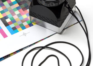
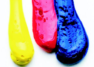
Getting the right colour profile for the finished job So, you’ve spent days designing your leaflet on your computer, the colours, nice bright, almost neon, look fantastic on screen and have fantastic impact so the finished printed leaflet will look just as eye- catching.. right..? Probably not.. unless you’re using the right design software your colours are most likely to be RGB. This stands for Red, Green, Blue and is how we see colour on screen - so TV, monitors etc. RGB is fine for use on the internet for websites as screens are not able to show as many subtle colours as print can, BUT because a screen tends to be lit, the colour appear to be more vibrant. When using colours for print, most designers should/will use CMYK or the four process colours of Cyan, Magenta, Yellow and Black in various percentages combined to achieve the final colour. Using these allows the flexibility of millions of colours and subtle tones, giving far more depth. However its worth noting that CMYK colours can only be reasonably represented on a specially calibrated screen - only then will you get a better idea of what the finished print job will look like. In short, you only ever use RGB if you’re designing something that will be seen on screen i.e. for websites etc. these colours WILL NOT reproduce correctly if used in print. If using your own photos for print, these will need to be converted to CMYK to print properly. CMYK should be used for all printed materials and if you’re in doubt over colours, ask to see a printed proof. For more information about colour space and profiles, you can Google it, but be warned, it can get complicated and is not always the easiest to understand!Image Quality
Resolutions for Print and Web Getting an image to look clean, clear and sharp is not as easy as you may first think. For instance, you’re using an image on your website that is nice and bright, doesn’t take long to download - can you use the same image, take it from your website and use it on your printed leaflet? In short NO.. this is because images used for web tend to be lower in resolution (dpi or Dots Per Inch) resulting in smaller files sizes and faster download speeds - ideal for use on the internet. To get a sharp image in print, generally the resolution needs to be higher at around 300dpi, but this means a bigger file size - however as its not being used on the internet, the bigger file size doesn’t matter quite so much, whereas the higher, better resolution does. You can see that simply assuming 300dpi for every project is a mistake. But do remember that you can rarely make the mistake of having too high a resolution. However you can have too low a resolution and end up with pixelated (blocky / dotty) images. So try to lean towards too much detail rather than not enough.Using Stock or Royalty Free Images
Why paying a small fee is better than paying a big fine! So many people nowadays believe that using an image found on a search engine is perfectly fine and has no consequences - hey its off the internet, so it must be OK..? The truth is, that it’s not OK, it’s THEFT. Taking and using someone else’s work without their permission is not just wrong, it’s illegal and if caught you can end up paying serious fines for doing so - its called breach of copyright and shouldn’t be taken lightly. A way to avoid costly court cases and fines is to use stock photo libraries like iStockphoto, Shutterstock, Corbis, Dreamstime to name just a few. Here there are millions of shots that you pay just a small fee to use (license) the picture and this allows you to carry on without the fear of breaking the law. The added bonus is that most of these shots are taken by professionals, so are going to be much better than that scratchy image you found on the search engine! In short, BE PROFESSIONAL, it’s cheaper in the long run.USEFUL STUFF
NEWS AND INFORMATION THAT WILL HELP YOU, YOUR DESGINER AND THE PRINTER The future belongs to those who prepare for it today - Malcolm X


NAVIGATION
SOCIAL
ADDRESS
Head Office
Elektra Designs
St. George’s House
93 Stratton Way, Barron’s Court
Cwrt Herbert, Neath Abbey
SA10 7AS UK
CONTACT
Mail: jody@elektradesigns.co.uk
Phone: +44 0 2921 971 321
+44 0 1639 641 674
Mobile: +44 0 7970 049 199
All Rights Reserved - Elektra Designs 2017


Royal Society of Arts Fellowship
Joe Dickens elected as a Fellow of the Royal Society of Arts May 2023 - Elektra Designs is delighted to announce that Joe Dickens, the company’s founding consultant has been elected as a Fellow of the prestigious Royal Society of Arts (RSA). This esteemed honour recognizes individuals who have made significant contributions to social progress and development through the arts, manufacturing, and commerce. Joe Dickens’ election to the RSA Fellowship is a testament to his innovative contributions and dedication to the design industry. Over more than two decades, he has transformed Elektra Designs from a small startup into a design firm with global reach, providing innovative solutions for its clients. About the Royal Society of Arts The Royal Society of Arts, founded in 1754, is dedicated to finding innovative practical solutions to social challenges. Through its influential Fellowship, the RSA brings together prominent individuals from a wide range of fields to collaborate and create positive social change. The RSA Fellowship is a network of accomplished individuals who share a commitment to enhancing human capability and advancing societal progress.
Need a Graphic Designer?
Joe Dickens is on Find a Business Experts panel of experts Joe Dickens, founding consultant of Elektra Designs, is on the panel of select experts at Find a Business Expert, enabling them to tap into the decades of
graphic design, print and branding knowledge that he has to offer for all of their clients in Cardiff, Swansea, Bridgend and across the South West.
Click on the video below to get to know him better, hear more about what he brings to the projects he takes on and how his clients benefit from his diverse
experience.

Commenting on his election, Joe Dickens said, “I am deeply honoured to be elected as a Fellow of the Royal Society of Arts. This recognition is humbling when you
consider the names of those who have also been elected as Fellows - to be counted amongst them is quite an achievement. I look forward to contributing to the
RSA’s mission and collaborating with fellow members to drive meaningful change in our society.”
Paper Sizes
A’s, B’s and C’s Paper is .. well paper.. right? Nope..! Paper, comes in a huge variety of sizes, weights and finishes, all have their own feel, look etc. which in turn influences how they are used. To try and give some sort of standardisation, pretty much all European countries use what we loosely call the A, B and C series of sizes. Most of you are already familiar with A4 - its what most businesses use for a letterhead and measures 210mm wide by 297mm high. An A3 page, while the number is lower (3 rather than 4) it is actually TWICE the size of an A4 sheet at 297mm wide by 420mm high - and so it goes for A2 being bigger than A3, A1 larger than A2 and so on. Conversely, A5 is HALF the size of A4 at 148mm wide by 210mm high and A6 is half the size of A5. So it’s worth considering just how large or small you want your finished image/design to be and discussing this with your designer - it can make a huge difference! For more on paper sizes, click here:Using Colour
Getting the right colour profile for the finished job So, you’ve spent days designing your leaflet on your computer, the colours, nice bright, almost neon, look fantastic on screen and have fantastic impact so the finished printed leaflet will look just as eye-catching.. right..? Probably not.. unless you’re using the right design software your colours are most likely to be RGB. This stands for Red, Green, Blue and is how we see colour on screen - so TV, monitors etc. RGB is fine for use on the internet for websites as screens are not able to show as many subtle colours as print can, BUT because a screen tends to be lit, the colour appear to be more vibrant. When using colours for print, most designers should/will use CMYK or the four process colours of Cyan, Magenta, Yellow and Black in various percentages combined to achieve the final colour. Using these allows the flexibility of millions of colours and subtle tones, giving far more depth. However its worth noting that CMYK colours can only be reasonably represented on a specially calibrated screen - only then will you get a better idea of what the finished print job will look like. In short, you only ever use RGB if you’re designing something that will be seen on screen i.e. for websites etc. these colours WILL NOT reproduce correctly if used in print. If using your own photos for print, these will need to be converted to CMYK to print properly. CMYK should be used for all printed materials and if you’re in doubt over colours, ask to see a printed proof. For more information about colour space and profiles, you can Google it, but be warned, it can get complicated and is not always the easiest to understand!Image Quality
Resolutions for Print and Web Getting an image to look clean, clear and sharp is not as easy as you may first think. For instance, you’re using an image on your website that is nice and bright, doesn’t take long to download - can you use the same image, take it from your website and use it on your printed leaflet? In short NO.. this is because images used for web tend to be lower in resolution (dpi or Dots Per Inch) resulting in smaller files sizes and faster download speeds - ideal for use on the internet. To get a sharp image in print, generally the resolution needs to be higher at around 300dpi, but this means a bigger file size - however as its not being used on the internet, the bigger file size doesn’t matter quite so much, whereas the higher, better resolution does. You can see that simply assuming 300dpi for every project is a mistake. But do remember that you can rarely make the mistake of having too high a resolution. However you can have too low a resolution and end up with pixelated (blocky / dotty) images. So try to lean towards too much detail rather than not enough.Using Stock or Royalty Free Images
Why paying a small fee is better than paying a big fine! So many people nowadays believe that using an image found on a search engine is perfectly fine and has no consequences - hey its off the internet, so it must be OK..? The truth is, that it’s not OK, it’s THEFT. Taking and using someone else’s work without their permission is not just wrong, it’s illegal and if caught you can end up paying serious fines for doing so - its called breach of copyright and shouldn’t be taken lightly. A way to avoid costly court cases and fines is to use stock photo libraries like iStockphoto, Shutterstock, Corbis, Dreamstime to name just a few. Here there are millions of shots that you pay just a small fee to use (license) the picture and this allows you to carry on without the fear of breaking the law. The added bonus is that most of these shots are taken by professionals, so are going to be much better than that scratchy image you found on the search engine! In short, BE PROFESSIONAL, it’s cheaper in the long run.USEFUL STUFF
INFORMATION THAT WILL HELP YOU, YOUR DESGINER AND THE PRINTER The future belongs to those who prepare for it today - Malcolm X


SOCIAL
ADDRESS
Head Office - Elektra Designs
St. George’s House, 93 Stratton Way,
Barron’s Court, Cwrt Herbert, Neath Abbey
SA10 7AS UK
CONTACT
Mail: jody@elektradesigns.co.uk
Phone: +44 0 2921 971 321
+44 0 1639 641 674
Mobile: +44 0 7970 049 199
Copyright and All Rights Reserved - Elektra Designs 2019


NAVIGATION


RSA FELLOWSHIP
Joe Dickens elected as a Fellow of the RSA
May 2023 - Elektra Designs is delighted to announce that Joe Dickens,
the company’s founding consultant has been elected as a Fellow of the
prestigious Royal Society of Arts (RSA). This esteemed honour
recognizes individuals who have made significant contributions to
social progress and development through the arts, manufacturing,
and commerce.
Joe Dickens’ election to the RSA Fellowship is a testament to his
innovative contributions and dedication to the design industry. Over
more than two decades, he has transformed Elektra Designs from a
small startup into a design firm with global reach, providing innovative
solutions for its clients.
About the Royal Society of Arts
The Royal Society of Arts, founded in 1754, is dedicated to finding
innovative practical solutions to social challenges. Through its
influential Fellowship, the RSA brings together prominent individuals
from a wide range of fields to collaborate and create positive social
change. The RSA Fellowship is a network of accomplished individuals
who share a commitment to enhancing human capability and
advancing societal progress.
Commenting on his election, Joe Dickens said, “I am deeply honoured
to be elected as a Fellow of the Royal Society of Arts. This recognition
is humbling when you consider the names of those who have also
been elected as Fellows - to be counted amongst them is quite an
achievement. I look forward to contributing to the RSA’s mission and
collaborating with fellow members to drive meaningful change in our
society.”


